Make your poster presentation awesome
A poster is not a stand-up paper. It’s a prop you use for pitching your research
In a few days I’m leaving for CEC2013 in Cancún, and I’ve lined up everything I need for my poster: magnetic and whiteboard paper, velcro tape and I still have to get ready (with the help of my beautiful and crafty daughters) some origami sombreros. Why do I need all this? Because a poster in a scientific conference is not just a poster, as in the “be awesome” that Barney has at his office or movie poster.
It’s a prop you use to pitch your presentation to a close-up audience.
So I wrote this up in my blog some time ago, and it’s about time to re-post and update it.
While there’s a lot of advice out there on making presentations at conferences, there’s not so much for designing and presenting posters in them. For instance, there is this extensive post by Colin Purrington on how to design and present scientific posters. Good advice it is, that will do no harm if followed.
My approach is different. The art of poster presentation in a scientific conference, like conference presentation itself, belongs more to the area of dramatic arts than to marketing. It is information/entertainment, and that is the main thing you have to bear in mind when preparing for the session your poster will be presented. Plus, while at a conference you have the full attention of your audience (shared, of course, with email, Facebook, plus the 10% that are simply talking to each other) in a poster session you have to first attract the attention of the people wandering around a hall shared with other 20 to 100 posters, then keep them there for the duration of the spiel and while you start a new one, and then, of course, convey the information you want to share with your poster.
I will not give you a few bullet points, just share my experience and you can pick and choose whatever you want.
First thing is to choose well the spot if you have the chance to do so (sometimes poster slots are pre-arranged). Show up early, put up your poster near the entrance or close to the toilets, in a place that people will see easily, not after walking the halls for a while. As in shops, location is important. If your place has been assigned in advance and you don’t like it, look for the best no-show and move there. Near the corners or the ends of halls is always the best. Close to food sources, if it’s a poster-and-snack session.
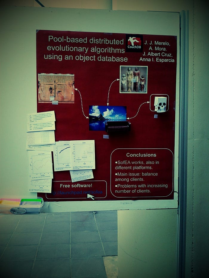
Second, keep your poster minimalistic and use dynamic elements to convey information during the spiel. A poster is just a prop to deliver the presentation, so I used velcros to set up slots so that I can move things around.

You can use them to show just a few graphs at a time, or to show real-life animations, data flow, phases in a methodology, whatever. The whole point of this is that the poster has been created to be explained, not to be there and be self-explanatory all by itself.

Posters are actually, or can be, 3-d objects. So put solid things there, papercraft stuff, use them for illustration or for fun, make it mobile, make it rock. I used a couch (my paper was about CouchDB) and a skull to show two parts of the algorithm I was presenting on that occasion, but there are lots of other things you can do. Use fun metaphors, create mockups, things people can look into and from the side.
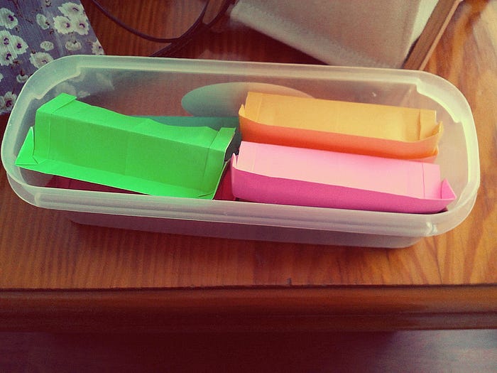
Try to keep it short and state clearly that you’ve finished. To emphasize that punch line, give something out. It can be your card, a copy of the paper, or even some small gift related to the paper. I gave out origami couches made by my daughter Cecilia (this has become a tradition lately), which people really liked. Actually, you can do this even if you don’t follow any of the other bullet points. People have a tight poster schedule and, what’s more important, don’t want to miss the coffee and cookies, so make it short and give them something to remember you for.

Besides, it gave them an incentive to stay for the whole duration of the spiel: they were only given out at the end.
Finally, design the poster to draw the attention of the audience, not to shoo them off. Too many graphs, too many letters, too many formulae… Too much work, they’ll go to the next one closest to their own line of work or just to spend a time with their friends. Too little, some mystery, what are those Velcros for, hey, I can have a free origami (or a gummy bear) after the spiel, it’s worth the while to devote one of my 5-6 poster slots to this person. And always remember to smile and thank them after the talk.
After all this, you can ask:
Did it work?
Oh boy did it work. People kept coming for the whole duration of the poster session, and you could see former customers bringing their coworkers and friends, to have a look or to listen to you. Which brings me to the last bit of advice regarding liquids, which is maybe the most important of all. Remember to empty your bladder right before the start of the session. And drink a bit of water (never coffee, never tea) after (never during each presentation). Because you’ll have to stand there the whole time, delivering your presentation. You’ll never have to leave your post.